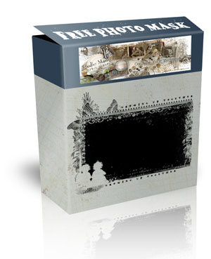
 |
Photo Mask Freebie
|
Comes with tomorrow’s newsletter right away to your inbox!
Isn’t it interesting in how many ways one can use just one photo mask or one could also say: Clipping Mask.
If you think a Photo Mask is a Photo Mask and can be used for photos, as the name says … then you are right of course. But that’s not all.
When you play a bit around you’ll realize there are many more possibilities and I want to show you a few.
First example is a layout using a clipping mask for a photo:
[singlepic id=1955 w=600 h=600 float=]
For the next example I changed a bit the layout’s composition here and there, as you can see and used the same clipping mask as background behind a photo.
It is always good to have a light background paper when the clipping mask is dark or the other way if you have a light photo mask look thatthe background paper is dark:
[singlepic id=1956 w=600 h=600 float=]
Last example I want to show is using a clipping mask as border.
I used in the following layout again the same clipping mask but doubled it, moved one part at the top of the page and the other part at the bottom and reduced both layers into one layer, so it is big enough for the page.
Doubled again and moved one part on the right site, the other part on the left site of my page. Love this idea too.
[singlepic id=1957 w=600 h=600 float=]
With tomorrow’s newsletter there is coming a Free Photo Mask to all subscribers, so that you can try it out and maybe you’ll find other ways how to use photo masks 🙂
That Photo Mask Freebie coordinates with the new Page Kit Release tomorrow: Growing Up Together
[singlepic id=1958 w=600 h=450 float=]
 |
Photo Mask Freebie
|


Manu…as always, I love your stuff! And thank you so much for the weekly specials – I just purchased one of them. Can’t wait to see the new kit – and, of course, would love to win it!